Habit Tracker - HabitKit reviews
What users love and hate · 500 reviews analyzed · ★ 4.3
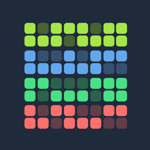
HabitKit is a habit tracker that sells not record-keeping but the pleasure of watching a GitHub-contributions-style grid fill up; it wins visual, aesthetics-driven users, yet its core motivational mechanic breaks on anything that isn't a daily habit.
What users love
The heat-map grid turns the checkmark into a reward — it sells dopamine from a filling board, not tracking
The real retention engine isn't reminders or stats — it's the visual itself: people describe an 'itch' to see progress and satisfaction from the growing grid. Ticking a habit is its own reward, with no fanfare or forced gamification, so they come back for the picture, not for discipline.
This gives me the visual feedback I'm looking for and the heat map is so satisfying. no gimmicks just a great design.
the " itch to get a good view of your progress" is rubbed by this app
The app is so beautiful that you want to continue your habits just to see how beautiful they are on the board!
The 'one big button' minimalism is its main competitive weapon against bloated trackers
The product deliberately strips everything away: one big completion button, zero friction between the habit and the moment you log it, no fanfare, no ads, no guilt for a miss. Users explicitly contrast this with 'invasive' rivals that 'try to sell something' on every tap. It draws people with ADHD and executive-function disorders who need to check in within a second and not drown in settings.
no ad every time you complete a goal, no 1 min fanfair when you click a single button, no guilt when you don't. all other trackers feel invasive or are trying to sell something, and this one is just a simple tracker app
If you suffer from an executive function disorder like me, I would argue this is a must have.
I have no friction between a habit and a moment to track it
A named indie developer is itself a feature — people buy 'to support the human,' not for features
A responsive author (Sebastian) turns support into a retention channel: people write in and get fast replies, feature requests get built, iOS purchases get migrated by hand. It creates a feeling rare among trackers — that 'you're not the product' — and some users buy Pro and lifetime specifically to support an indie dev. Trust in a person converts where the feature set alone wouldn't.
Sebastian (the creator) has been very friendly and added it to the focus! Lifetime membership is a steal
Really love this! You dont need to pay for it to function, but there's a one time purchase offer for more features i really recommend (the price is really fair!). Its such an easy and simple app and the dev is really nice!
customer service is also top notch - I had a question about bringing over my tracker info from a previous device
A lifetime one-time purchase instead of a subscription is itself a reason to buy
In a market where everything is a subscription, a one-time lifetime purchase reads as honesty and removes the biggest objection — 'I don't want yet another subscription.' Users single it out as a reason to trust and pay, comparing the price to 'lunch.' It turns the pricing model into a conversion lever: people buy not just the features but the freedom from a yearly charge.
I like the dark mode and colorful graphics, as well as the fact they offer a one-time payment which appears to be rare in these sorts of apps as of ~2026
I love that there's an option for a lifetime subscription. Do yourself a favor: sign-up today, upgrade your personal accountability, and even sub Pro for the cost of lunch
Super fair pricing and the option for a lifetime license so I'm quite happy to support the dev even though you can get most of the value on the free version.
Deep customization (colors, icons, groups) makes the board personal — and turns users into evangelists
Being able to tune colors, emojis, groups and views turns the tracker into a personal, 'mine' space worth showing off. Users show the board to friends and pull them into tracking — so customization works as an organic acquisition channel. Aesthetics here aren't cosmetic but a mechanism: the prettier and more personal the board, the higher both retention and word-of-mouth spread.
It's also so effective to glance and see effort, that I've gotten a few friends into habit tracking by showing them what I'm up to.
I love being able to customize my habits and sort by groups, colors, etc and go back in case I forgot to check days.
the customization options let me track habits across health faith and home care effortlessly
What users hate
The reward-grid punishes rest: days when the habit isn't due stay blank and read as a failure
The very mechanic that motivates daily users breaks everyone on a '3-4 times a week' schedule: on a planned off-day the cell stays blank and the board looks full of holes, as if they lapsed. Rivals draw hollow checkmarks on those days and keep the streak alive — here the visual reward becomes a visual punishment and demotivates exactly the users who deliberately don't do the habit every day.
With Habitkit, the days I don't need to complete the habit are just left blank (no streak for you!). It's very demotivating.
Otherwise, even though I complete a task set for once a week, the board looks like it is missing colors spots. This, makes me think I have NOT completed the week's task and therefore I get no good feeling from it.
It's important for me to not workout everyday of the week, I need an option at least 4-6 times a week
The 4-habit cap hits exactly when a user starts building a system — and resets the first impression
The free tier caps you at 4 habits — a wall not on some extra feature but on the product's whole point (tracking habits). Serious users build a set of a dozen routines, hit the wall precisely at peak engagement, and read it as 'a tracking app that won't let you track.' The wall arrives before the product proves its value, so a chunk of users churn during onboarding instead of converting.
What the hell? How you gon' make an app for tracking habits and only allow users to track up to 4??
The app is nice. I have just started to use it and was looking forward to building better routines through it. but it only offers me a feature to add 4 habits.
only 4 free habits, please be more upfront abt that so I don't waste my time 😭
The widget IS the product, but it's paywalled — without a home-screen glance the habit drops out of memory
The home-screen widget is the key behavioral mechanism: it prompts a check-in without opening the app and closes the habit loop. Paywalling it cuts free users off from the one thing that stops them 'forgetting to open the app' — and they openly admit that without a widget they'll stop using it within days even while still doing the tasks. The wall sits on exactly the feature that drives retention.
a good concept but without one glance tap widget, within days, I'll stop opening the app all together even when I am doing my tasks. so basically it will become useless.
free version needs atleast a small widget. kind of hard to use it without one. uninstalling. :-(
Would love to try this app properly but the basic features such as widgets are behind a pay wall.
The paid Android widget works badly — users buy the main reason to pay and get something rough that breaks
For many the widget is the only reason to pay, yet on Android it's exactly where the product stumbles: it looks alien, doesn't follow the app's own design language, bloats up, or stops working a month into the subscription. That's the worst possible funnel — the user pays for one specific promised outcome, doesn't get it, and a paying customer's disappointment cuts deeper than a free user's.
paid for the premium version so that I could get the widget and the widget doesn't work
paid for a years premium and after a month the widgets stopped working unless you make them huge. Real shame cus it's a nice app just the whole point for me was the widgets
I bought a pro because I wanted the widgets but it's not what I expected . They look so out of place and don't follow the design language of the app itself.
No cloud sync makes the habit a hostage of one phone — switching devices threatens to wipe the streak
Backup is manual export/import only — no account, no auto-sync. For an app whose value compounds over years of streaks this is an existential risk: a lost or broken phone threatens all progress, and moving paid access to a new device turns into a demand to pay again. Users have begged for cloud/email auto-backup for years — its absence erodes trust precisely among the most loyal, who've banked hundreds of days.
The only thing it's missing, it's being able to create an account and save your progress in different devices that syncs automatically
i need to buy the pro on each phone or else leave all my 250 days progress
If you buy and keep your habits tarcked and one day if your device breaks or lost you lose all your stats. Can't stress enough to have an automatic backup system.
No 'negative habits' — a whole quitting segment (smoking, drinking) is served only via workarounds
The product is built for achievement habits ('did it — tick the box'), but a large segment wants the opposite — quitting: stop smoking, cut back on alcohol, count clean days. Today that's only possible via an inverted workaround, with no mode where a tick = relapse and green = abstinence. Users explicitly ask for a 'positive/negative habit' flag; without it HabitKit loses everyone who needs a tracker for 'not doing' rather than 'doing.'
It does not support negative habits, like quitting smoking, or limiting drinks per week.
What I wish for is some way to make a habit as a "negative habit", for things to avoid or habits to quit.
The only thing missing for me is negative habits (Not smoking etc). Being able to setup an anti habit which ticks itself at a set time each day if I've not updated it to say I failed would be perfection.
Unreliable reminders undercut the one job a tracker must do
For an app whose value is not forgetting the habit, flaky notifications are critical: they fire some days and not others, morning ones go silent while evening ones work. That breaks the behavior loop for users who don't open the app on their own and rely on a nudge. When the reminder is the one thing that must work, its unpredictability directly nullifies the product for the forgetful segment.
You cannot rely on the notifications. One day they work, the next they don't. My earlier in the day ones won't but my evening ones do. It's ridiculous.
stopped notifying, which is the sole thing it needed to do
The reminders for the habits often don't show up
No decimals or time units — the product locks out measurable habits (sleep, weight, miles)
The counter handles only whole numbers and vague 'times' — no decimals, no time, no custom units. That pushes out a whole class of users who need to log 'slept 7.4 hours,' 'weigh 164.3,' 'ran 6.7 miles,' or time spent. For them the app stops being a tracker and becomes just a pretty checkmark calendar — and they leave for rivals that support arbitrary values.
Can't track habits in fractions. Example; slept 7.4 hours, weigh 164.3lb, ran 6.7 miles, etc. Also can't track habits by time spent.
It doesn't have option for decimal points like 0.7 or 2.75
no option to mark skip, no option to track time
An aggressive review prompt in the first minute burns trust before the product can prove itself
The app asks for a rating literally 10-60 seconds after install, before any real experience. For a product that lives on the feeling 'you're not being milked here,' it's self-harm: users one-star it by default purely for the early begging and read it as a signal that 'the developers are bad.' The timing turns a neutral ASO tactic into the first negative impression.
About 10 seconds into using this app, I literally do 1 thing and this app is already asking for a review so by default I am rating it a 1 star.
this app asking , intrusivly, for a rating and review after 1 minute of use? its stupid, aggressive and pointless. means developers are bad
In the 3 minutes I explored the app I was served a pro conversion prompt 5 times
The UI doesn't adapt to tablets and foldables — scaling breaks the very 'beauty' the app is bought for
Custom interface scaling falls apart on large and non-standard screens: on a tablet everything looks 'horrendous' and bloated, on foldables it's overly magnified, and on phones it shows a 10-inch tablet screenshot with unreadably tiny text. For a product whose core USP is visual appeal, broken scaling strikes the heart of its value and scares users off at first glance.
looks absolutely horrendous on a tablet because of the custom interface scaling.
they've shown a 10" tablet screen on my 6" phone screen
can you please optimise the layout on Fold phones. It looks overly magnified. please just zoom out a bit.